
Alice Tebaldi Designer
L’Apeperina Miele
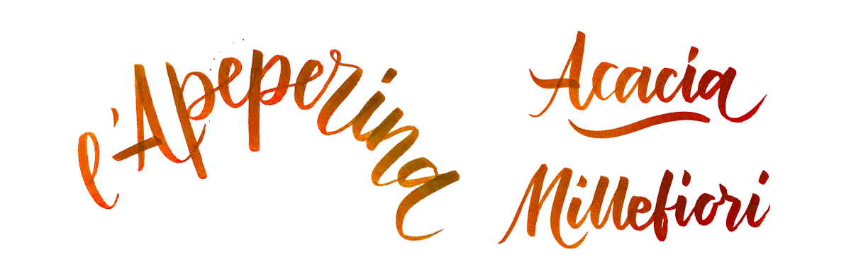
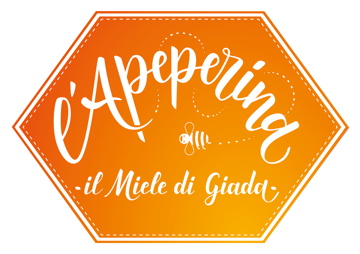
Progettazione di Logo ed etichette per L’Apeperina miele, un piccolo brand artigianale che con passione e dedizione si approccia al mondo della produzione del delizioso “oro liquido”. L’idea di progetto è nata in collaborazione con Giada, la titolare, a cui piaceva l’idea di avere un’identità vivace, un logo calligrafico e l’etichetta iscritta in un alveare esagonale. Qui sotto le prime bozze realizzate con una brushpen Tombow:
—–
Logo design and labels for L’Apeperina honey, a small craft brand that with passion and dedication is approaching the world of the production of the delicious “liquid gold”. The project idea was born in collaboration with Giada, the owner, who liked the idea of having a lively identity, a calligraphic logo and the label inscribed in a hexagonal beehive. Below are the first drafts made with a Tombow brushpen:
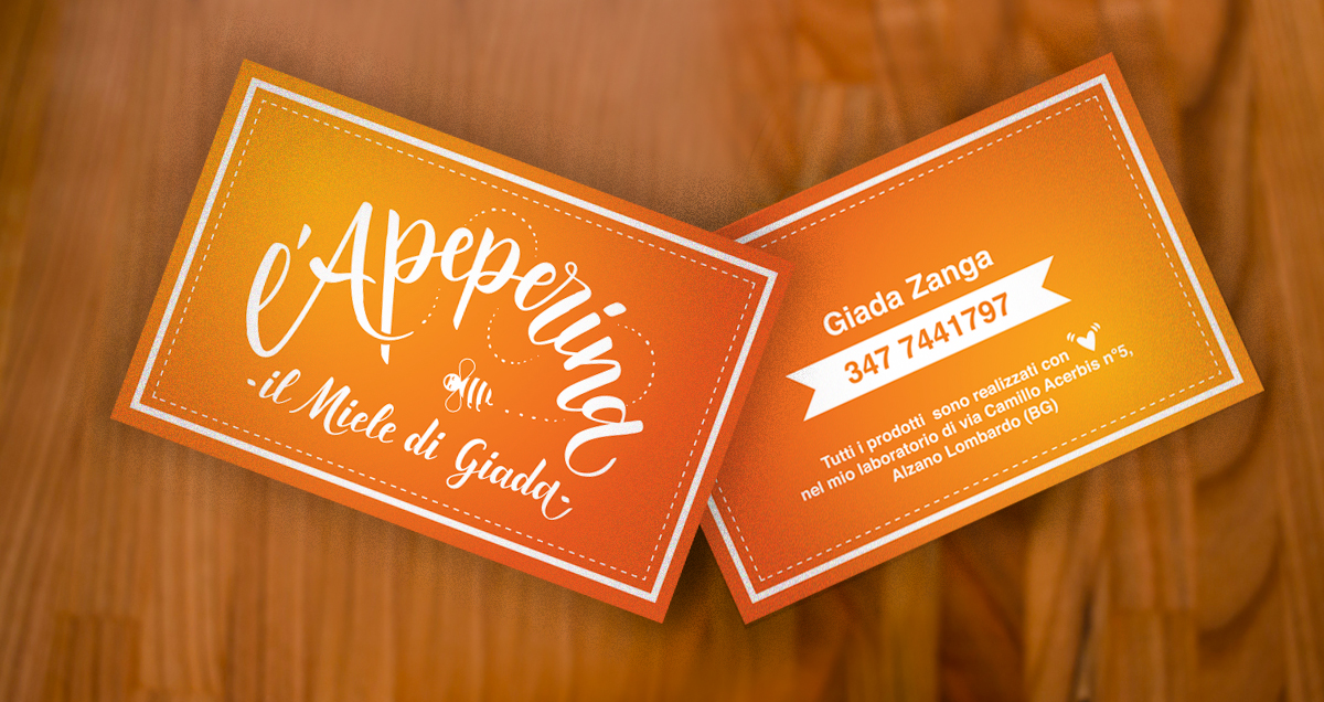
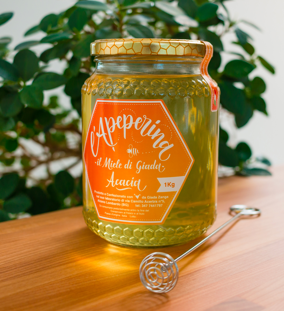
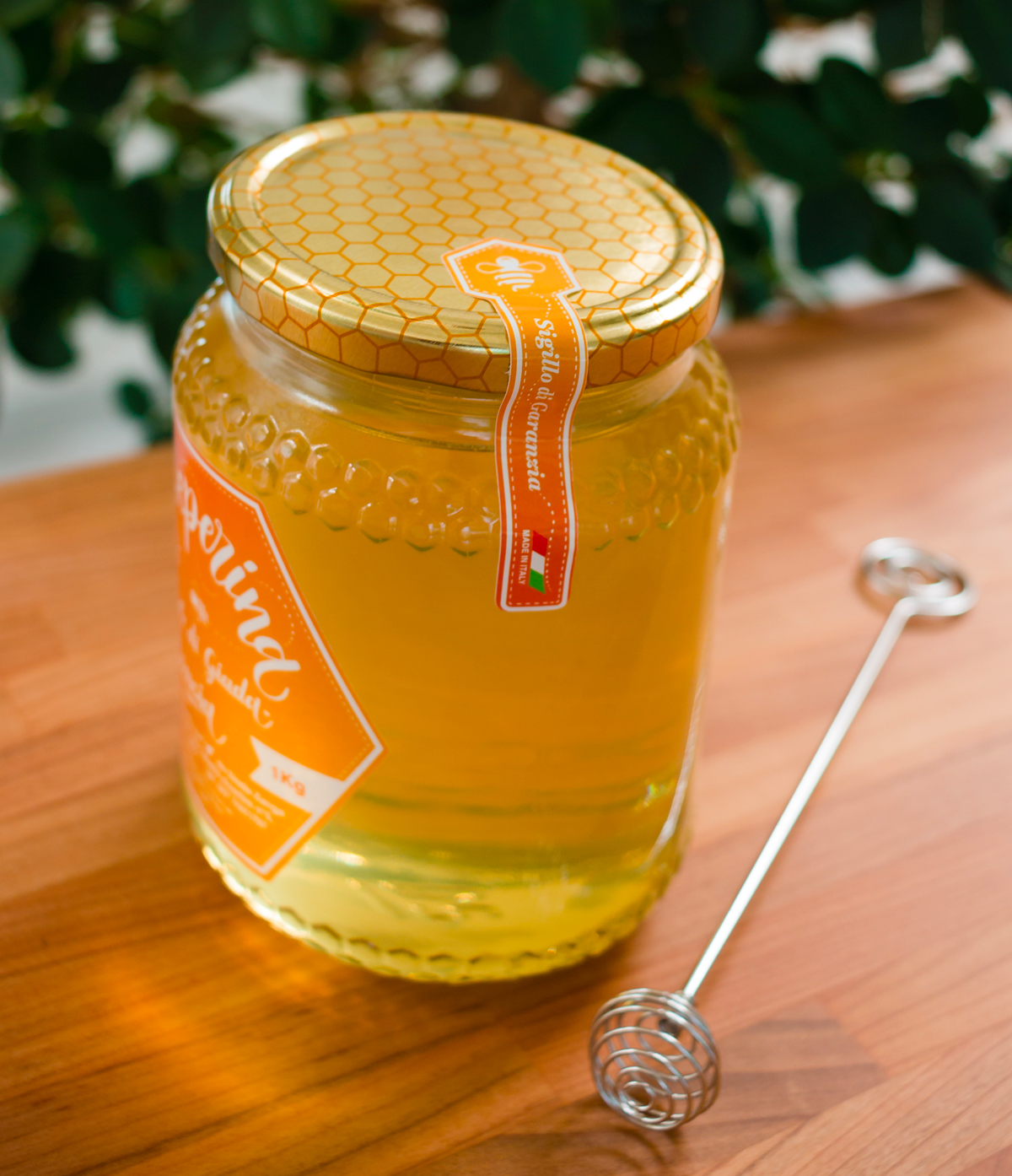
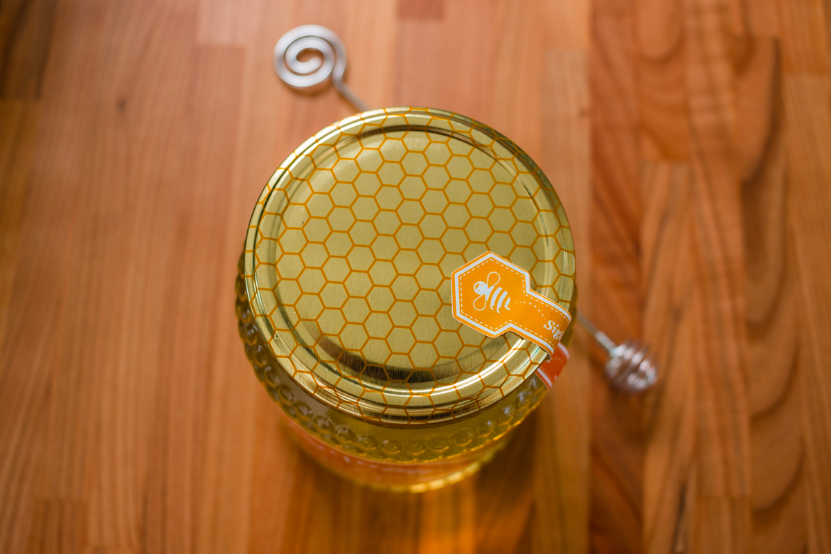
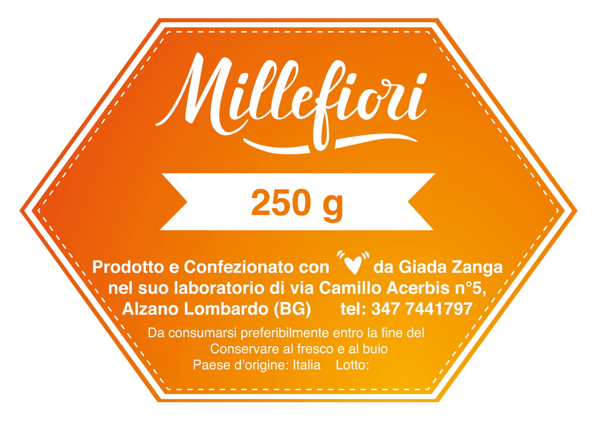
Qui sotto il biglietto da visita e alcune foto del barattolo da 1 Kg (l’etichetta è impaginata come la versione più piccola dei 500g) e sotto la variante dell’etichetta per i 250g (fronte e retro). Abbiamo preferito la versione negativa del logo a quella positiva per la sua forza e incisività cromatica. Per ora Giada produce due tipologie di miele: Acacia e Millefiori, davvero deliziose, ma rimaniamo in attesa di tante nuove varietà 🙂
—-
Here below the business card and some photos of the 1 Kg jar (the label is paginated as the smallest version of the 500g) and under the label variant for the 250g (front and back). We preferred the negative version of the logo to the positive one due to its strength and chromatic effect. For now Giada are producing two qualities of honey: Acacia and Millefiori, really delicious, but we look forward to many new varieties 🙂
—-
L’Apeperina
2018
Skills
- Calligraphy
- Graphic Composition
- Print assistance
Share This
- Tweet
-
Qui sotto il biglietto da visita e alcune foto del barattolo da 1 Kg (l’etichetta è impaginata come la versione più piccola dei 500g) e sotto la variante dell’etichetta per i 250g (fronte e retro). Abbiamo preferito la versione negativa del logo a quella positiva per la sua forza e incisività cromatica. Per ora Giada produce due tipologie di miele: Acacia e Millefiori, davvero deliziose, ma rimaniamo in attesa di tante nuove varietà 🙂
—-
Here below the business card and some photos of the 1 Kg jar (the label is paginated as the smallest version of the 500g) and under the label variant for the 250g (front and back). We preferred the negative version of the logo to the positive one due to its strength and chromatic effect. For now Giada are producing two qualities of honey: Acacia and Millefiori, really delicious, but we look forward to many new varieties 🙂 —-
L’Apeperina
2018
"> -

