Alice Tebaldi Designer
Consorzio Tecnologico Linea 4.0
Progettazione di un nuovo logo per Consorzio Tecnologico Linea 4.0 , nato dall’unione di tre grandi gruppi, che si occupano di consulenza e soluzioni informatiche, software gestionali e Enterprise Mobility. L’obiettivo era trovare un logo con un pittogramma capace di descrivere tre elementi fondanti, che sono alla base di questo Consorzio:
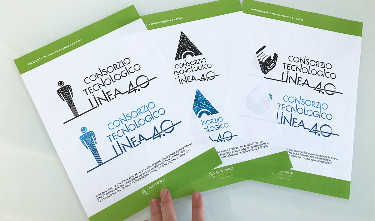
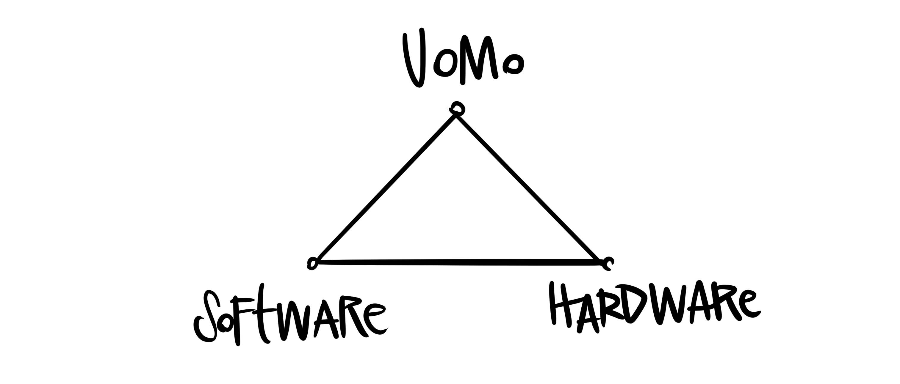 L’uomo grazie al Software e all’Hardware da lui generato, può fare grandi cose. Qui sotto le prime proposte in cui il pitogramma ha una forte rilevanza ed esalta questo “potere informatico” proiettato verso il futuro. Il carattere utilizzato non è il classico font digitale, bensì un carattere dalle proporzioni perfette nel quale alcune parti vengono come incise a laser da uno strumento di precisione, che crea un senso di tridimensionalità.
———
Design of a new logo for Consorzio Tecnologico Linea 4.0 , born from the union of three large groups, which deal with consulting and IT solutions, management software and Enterprise Mobility. The goal was find a logo with a pictogram capable of describing three founding elements, which are at the base of this Consortium: Man – Hardware – Software. Man, thanks to the software and the hardware he generates, can do great things. Below the first proposals in which the pictogram has a strong relevance and exalts this “information power” projected towards the future. The character used is not the classic digital font, but a character with perfect proportions in which some parts are laser-engraved by a precision instrument, which creates a sense of three-dimensionality.
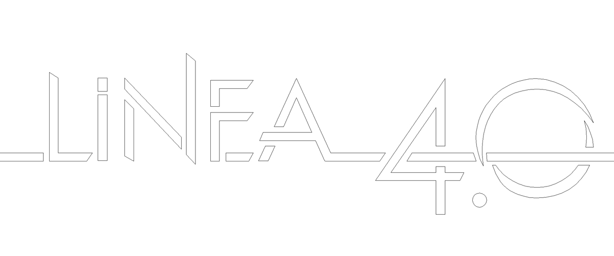
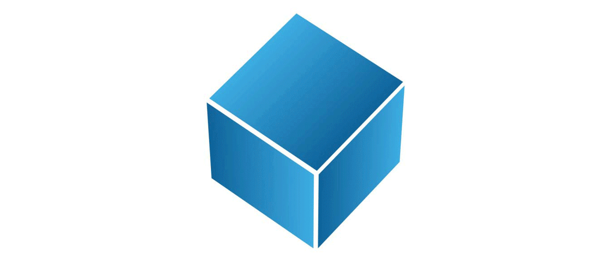
Scelta la bozza, i pesi degli elementi sono stati sistemati. Linea 4.0 risulta essere l’elemento chiave del marchio e Consorzio Tecnologico assume un’importanza secondaria. Nel cubo tridimensionale si possono intravedere: la mano dell’uomo che guida e i contatti elettrici che vanno poi ad espandersi verso il disco rigido, nel quale è presente il software. Qui sotto la versione finale e una piccola animazione del cubo.
———-
Once the draft has been chosen, the weights of the elements have been fixed. Linea 4.0 is the key element of the brand and Consorzio Tecnologico has a secondary importance. In the three-dimensional cube we can see: the hand of the man who guides and the electrical contacts that then go on expanding towards the hard disk, in which the software is present. Below is the final version and a small animation of the cube.
![]()
——
Axima, Consorzio Tecnologico 4.0
2017
Skills
- Logo Design
- Lettering